Tailoring the Experience for a Small Business and Its Customers
Background
Hazel Street is a small e-commerce business that sells laser-cut products. The goal was to create a custom app and website to streamline the purchasing and customization process for customers.
Challenge
Using certain e-commerce platforms can be challenging because they are designed to accommodate a variety of vendors. This complexity makes it more difficult and time-consuming for both sellers and buyers to navigate the system. This challenge is evident when it comes to selling and ordering custom items.
Tools
Figma
Photoshop
Illustrator
HTML, and CSS
Impact
Customized website and app for business-specific services.
Created online presence and business outreach.
Developed unique branding for the company to stand out.
Research
Research was conducted to address various challenges related to shopping habits. A survey involving 15 participants was carried out to gather insights into how specific app and website features could improve the shopping experience.


Personas
The research survey offered deeper insights into developing personas and scenarios for various users, including purchasing items as gifts for family members, with different options in price and quantity.

Jill - Age 35 - Loves board games.
Jill has been married to her husband, Mark, for five years, and she is looking for a special gift to celebrate their anniversary. Both Jill and Mark enjoy playing board games, and since Mark is a contractor with his own company, she wants to find a way to incorporate his company logo onto a board game. However, Jill has never ordered a custom item before and is having difficulty finding a way to make this happen. Her budget for the gift is around $50.

Liz - Age 28 - Baker & business owner.
Liz has recently opened her bakeshop and is selling her baked goods both online and at her physical store. To promote her new business, she wants to include something special with each order. Liz plans to add custom keychains featuring her bakeshop logo, as a way to spread the word about her shop. She is looking to purchase these keychains in bulk and needs assistance visualizing how her logo will look on them. Her budget for this project is between $100 and $150.
Low-Fidelity Wireframes
Based on the research, the app must be robust enough to accommodate all customizable options while maintaining an easy-to-navigate user interface. Several iterations were created to outline the main UI, taking into account hand placement and ensuring an excellent shopping experience. Mobile, tablet, and web versions were designed simultaneously to ensure consistency across all platforms.
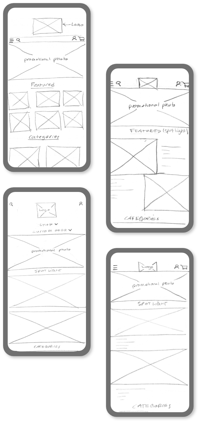
High-Fidelity Wireframes - Mobile
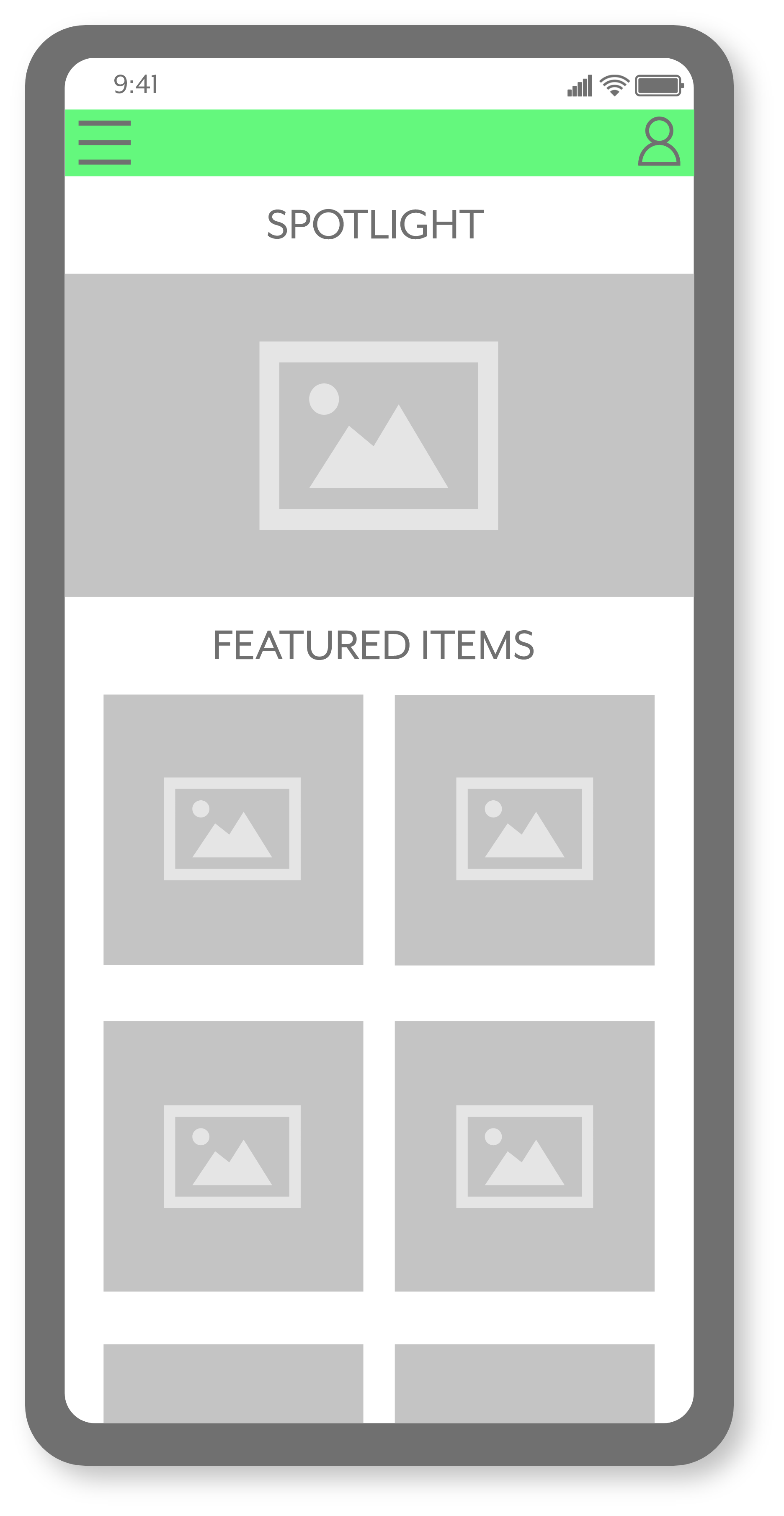
The landing page highlights new items, sales, featured products, and various product categories.
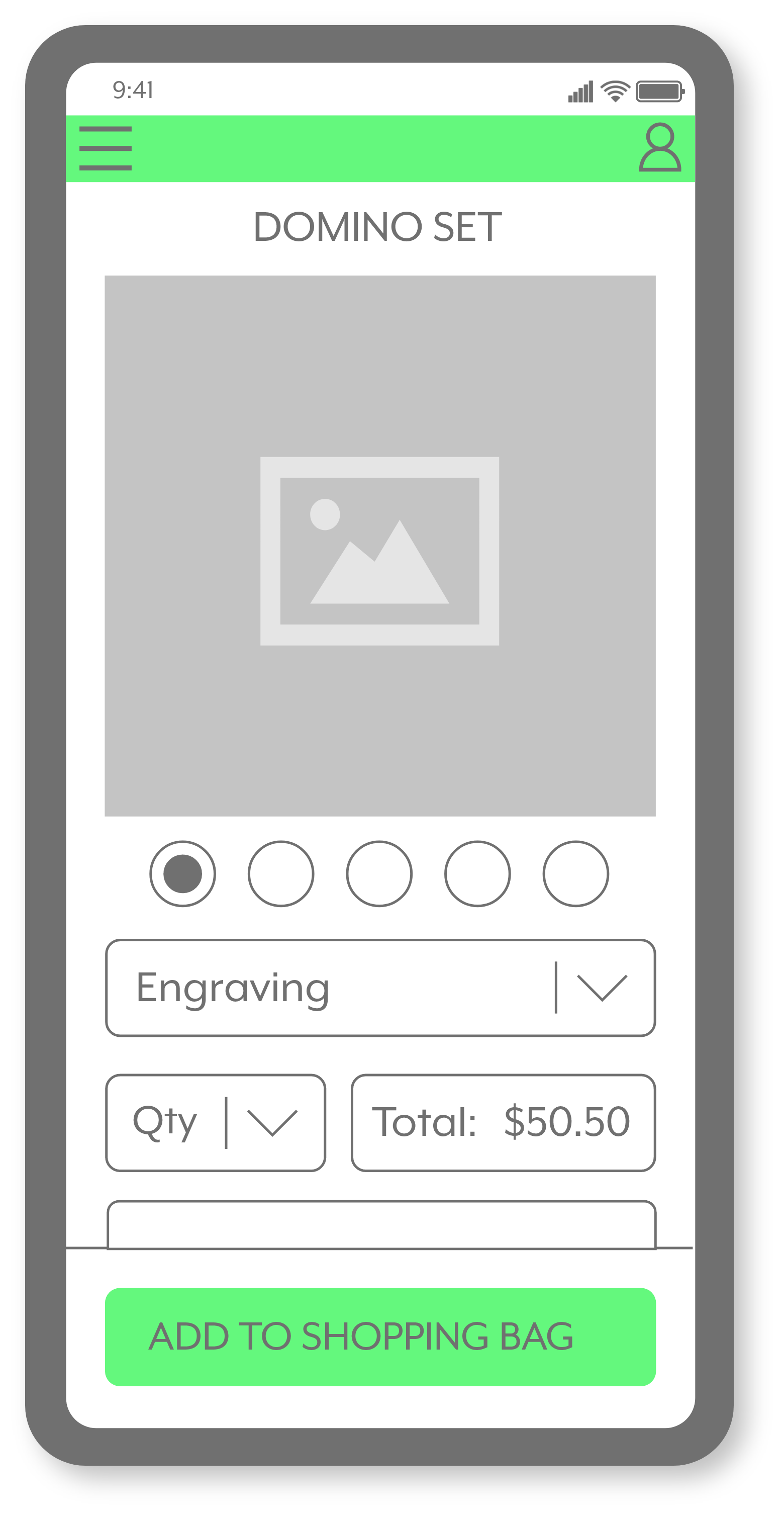
Once an item is selected, this screen displays more information, such as personalization options for the shopper.
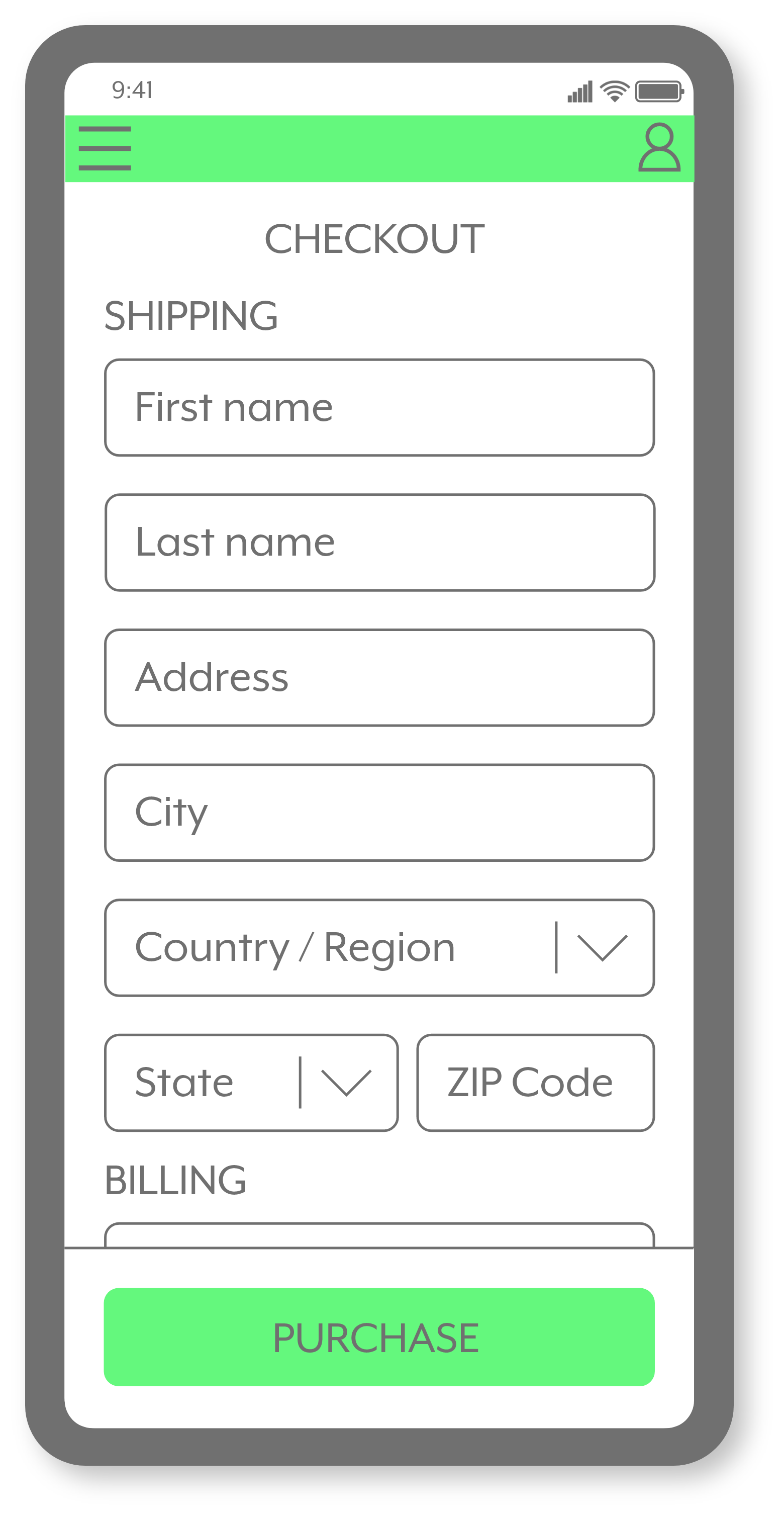
The purpose of the checkout screen is to streamline the buying process.
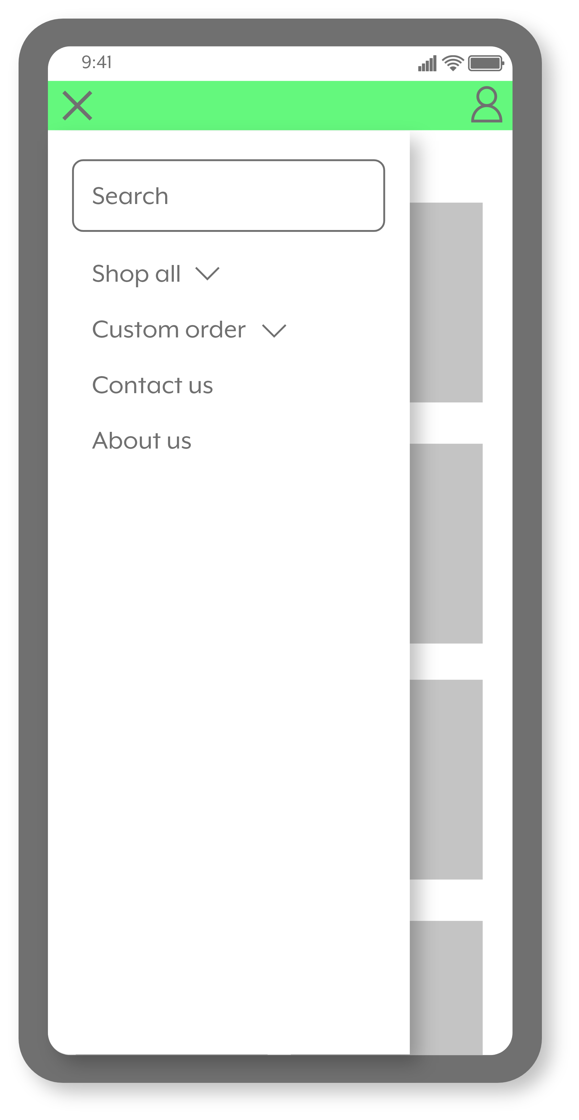
The goal is to create a simplified menu for easy use, whether for purchasing or making custom orders.
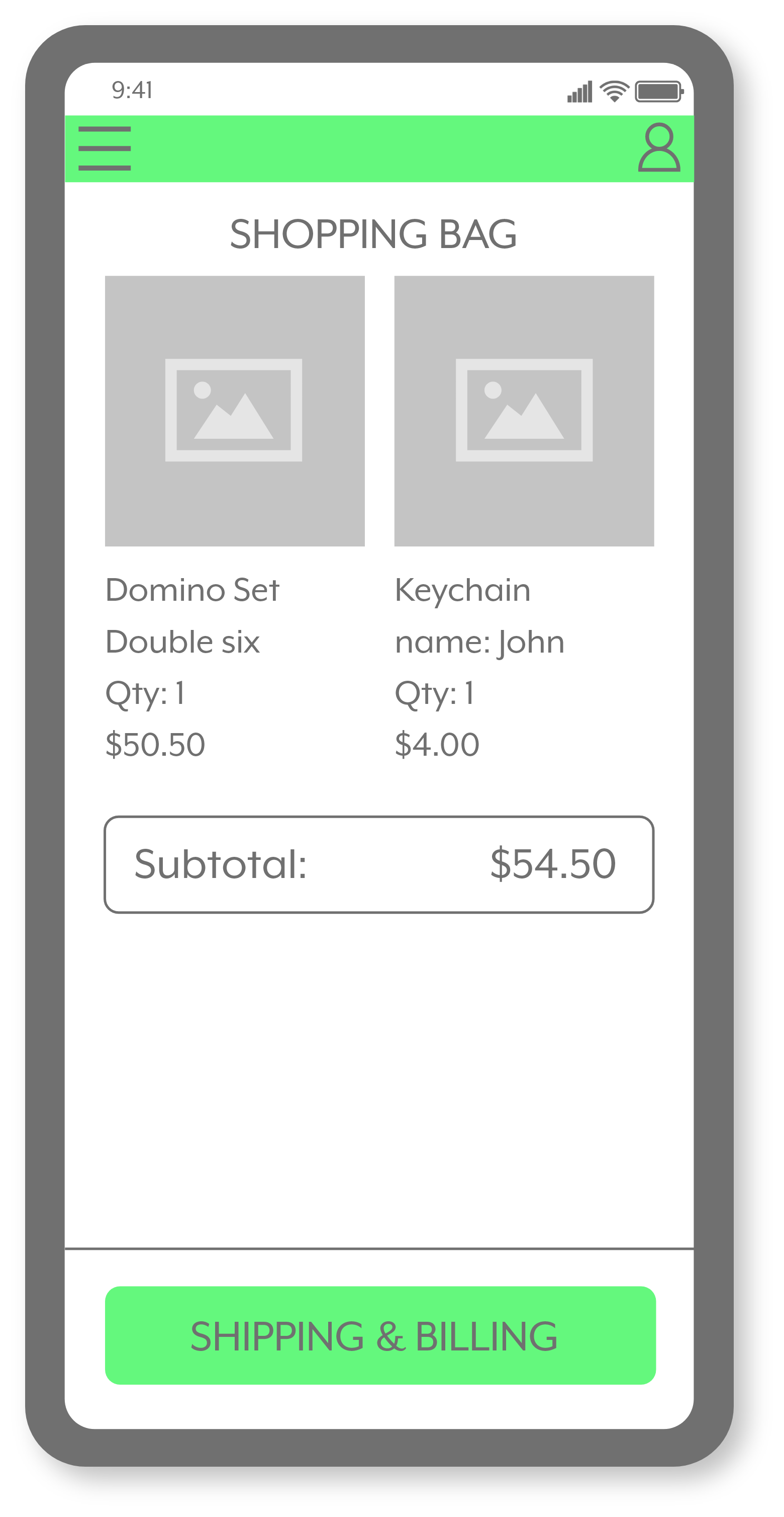
Shows all items being purchased and the total amount before the shipping and billing information.
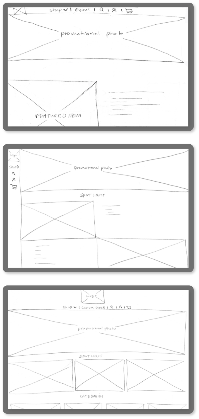
High-Fidelity Wireframes - Website
This screen is meant to guide and introduce the customer to the store, show what is available, and introduce a filter system to make shopping easier.
All the information the shopper needs is included in the menu, allowing the site to function without excessive screen changes and interruptions during shopping.
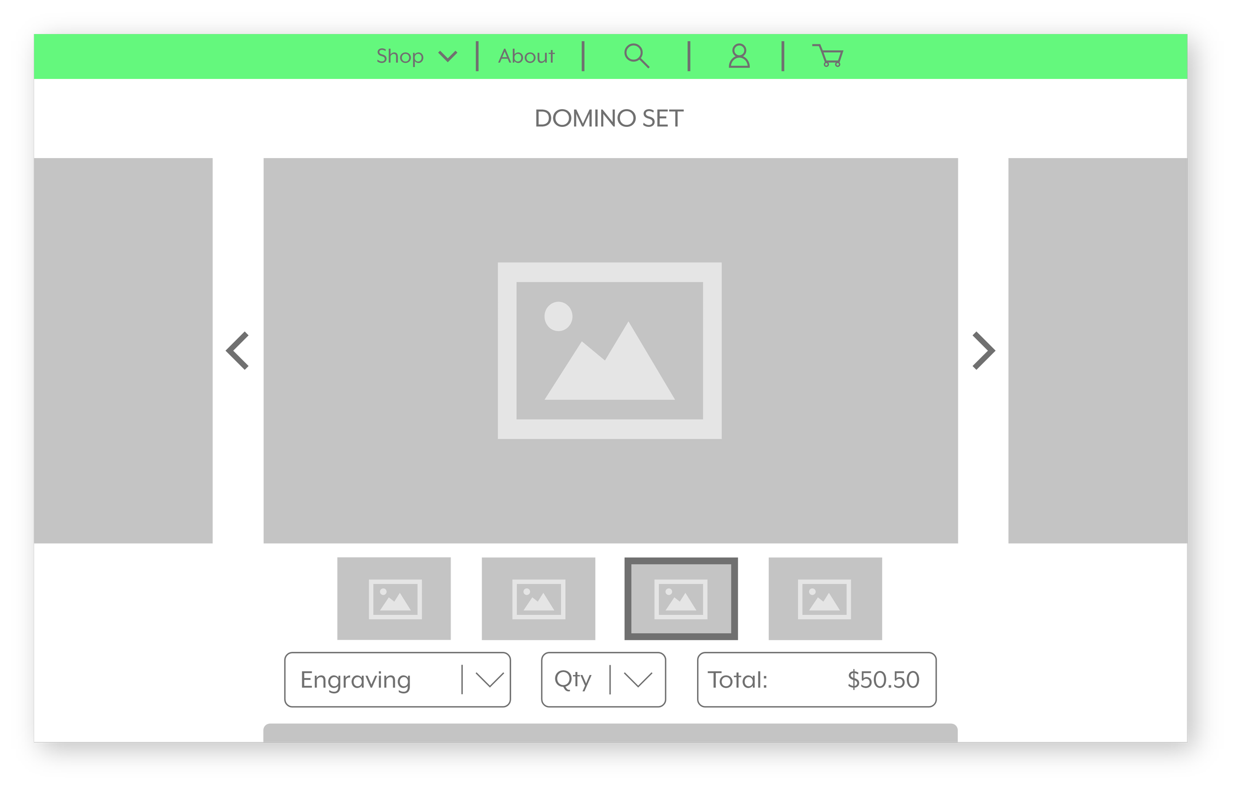
Like the app version, this screen shows more details about the item selected, just tailored in a wider format.
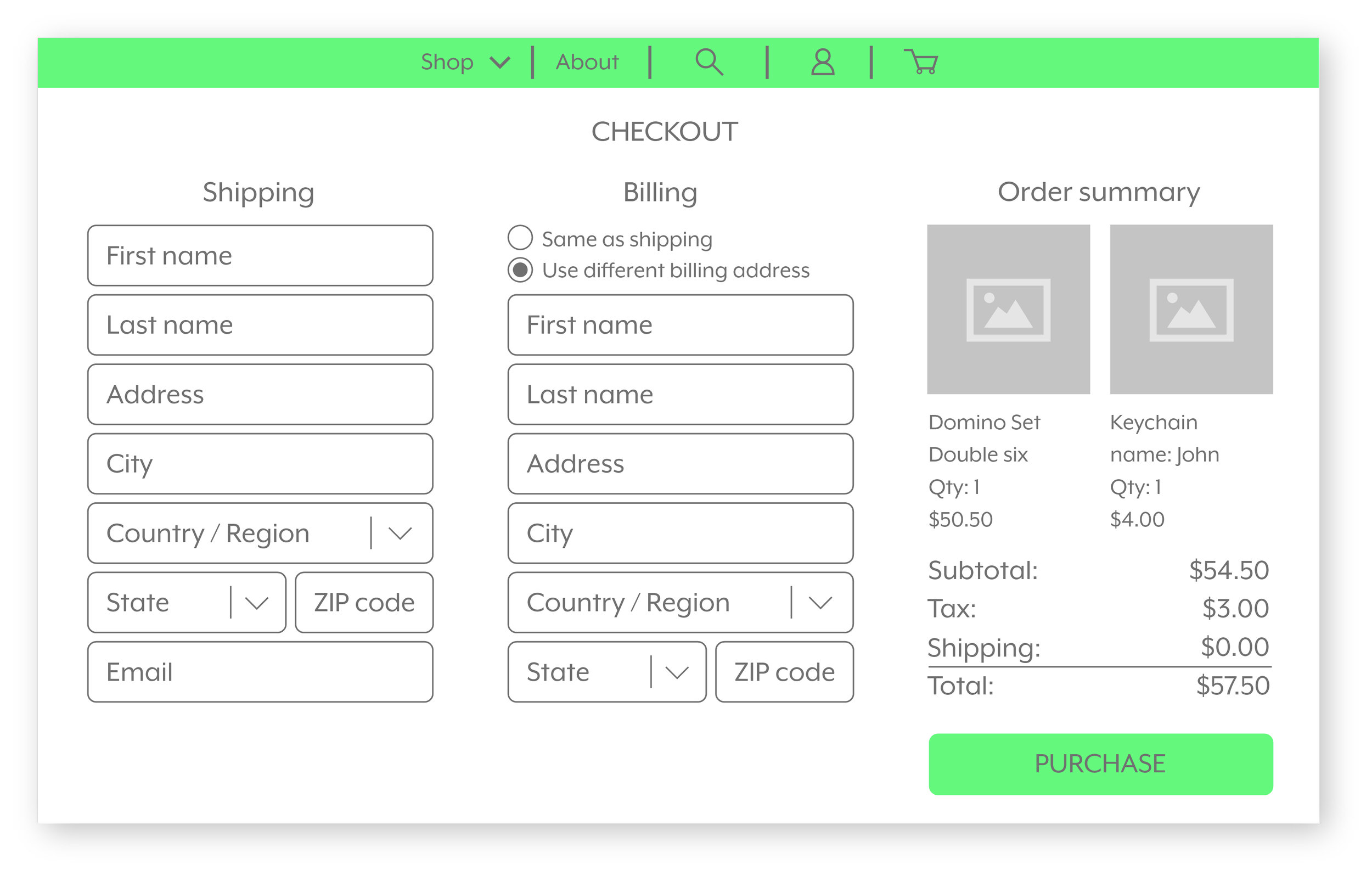
To make checkout times simple and efficient, all the needed data for purchase will be on one screen.
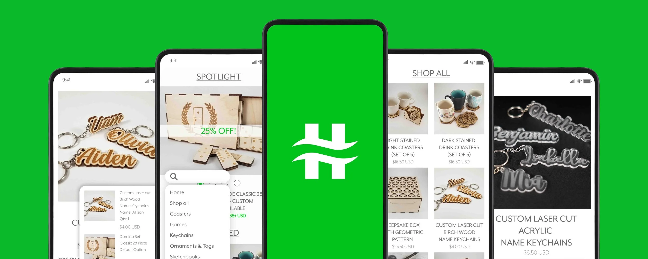
Final Design - Mobile
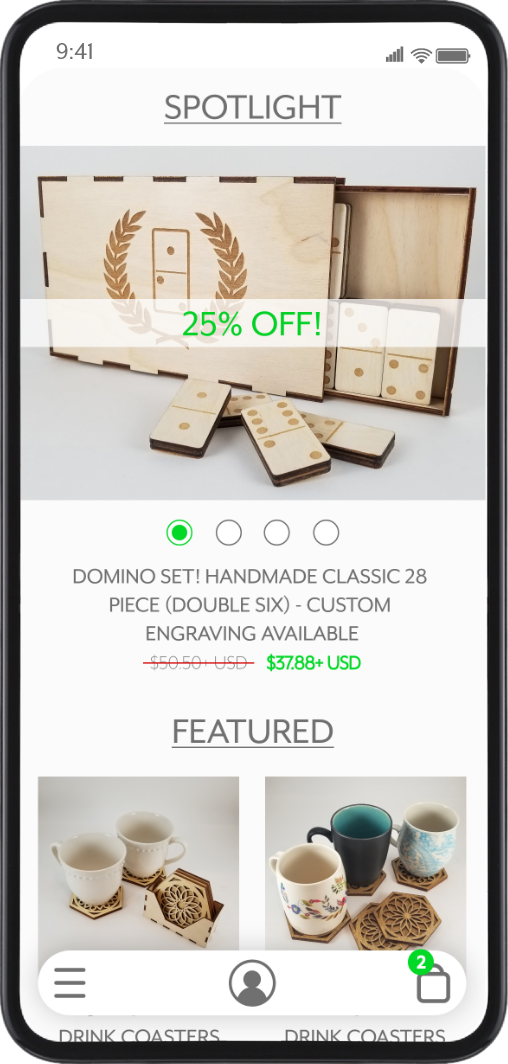
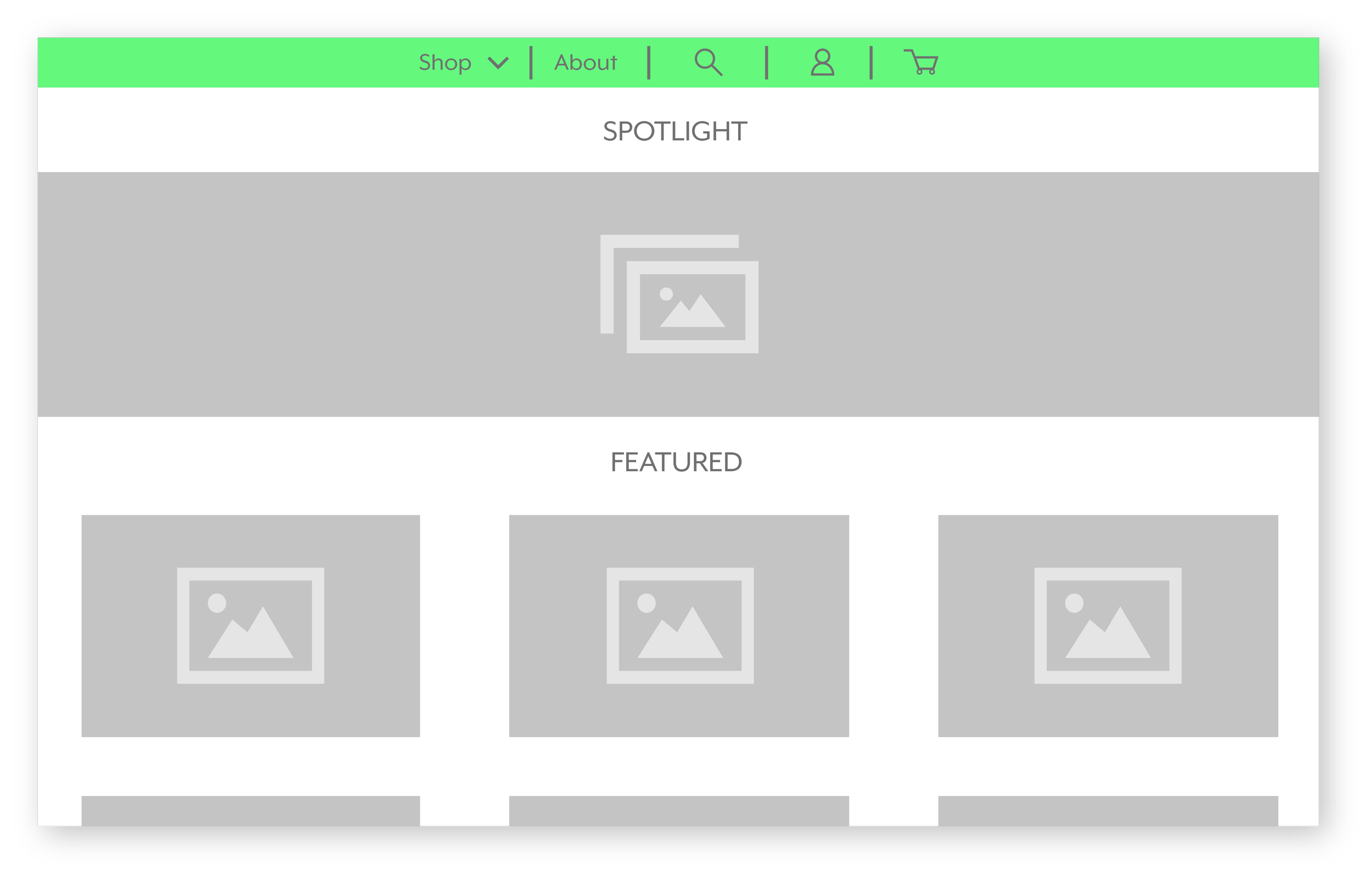
The landing page showcases promotional photos, sales, featured items, and product categories.
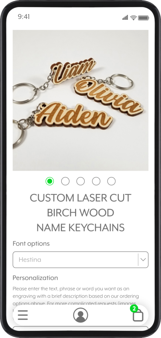
The item details screen displays all photos, purchasing options, and customization features, making shopping easier for every customer.
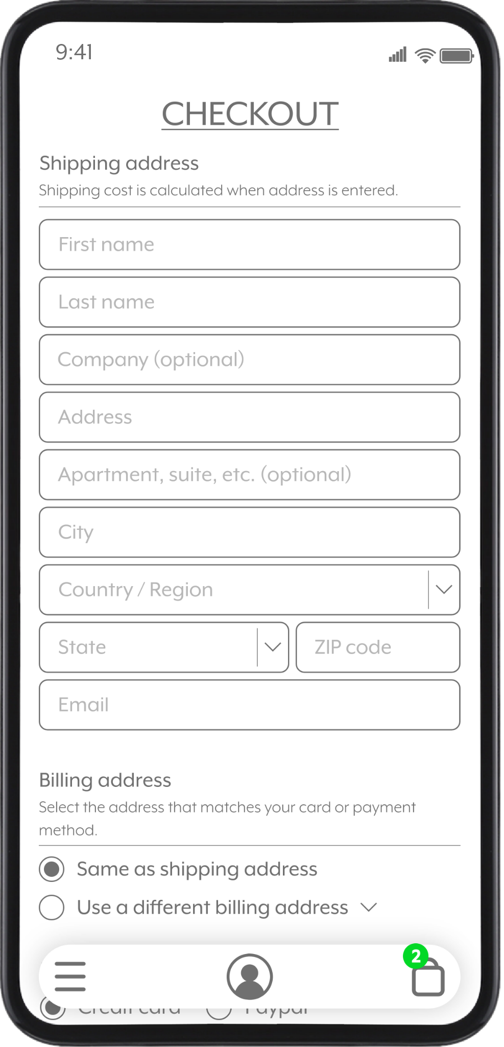
With shipping, billing, and the contact information being on one screen, it allows for a simpler checkout.
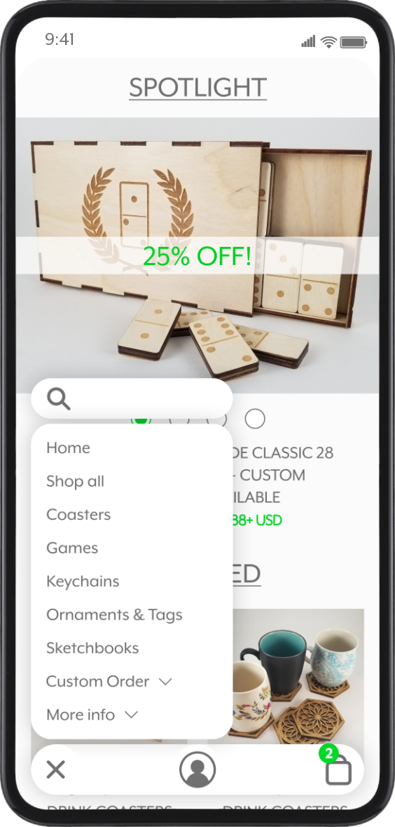
Unlike the wireframes, the UI was changed to 3 buttons at the bottom for ease of use and comfort for hand placement and access.
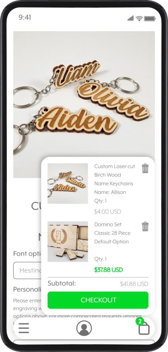
The shopping bag menu allows the user to view the total price and items added at all times, even while browsing.
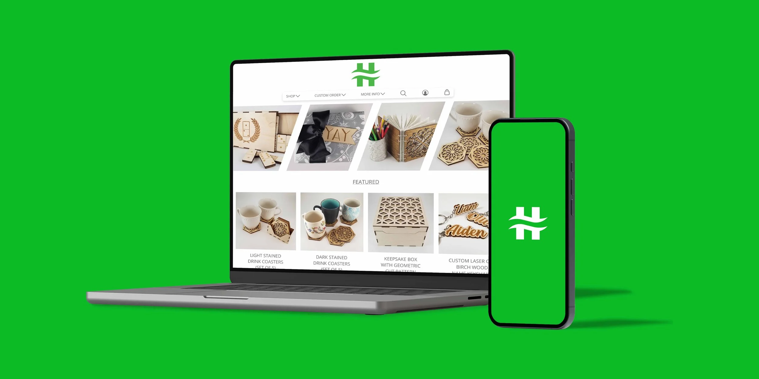
Final Design - Website
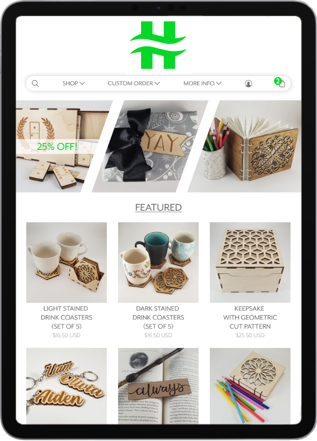
This will be the first screen users interact with. Similar to the mobile app, it will provide customers with a snapshot of promotions, sales, and new and popular items.
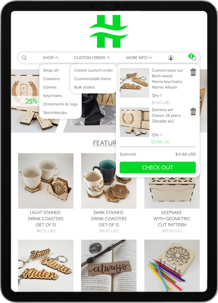
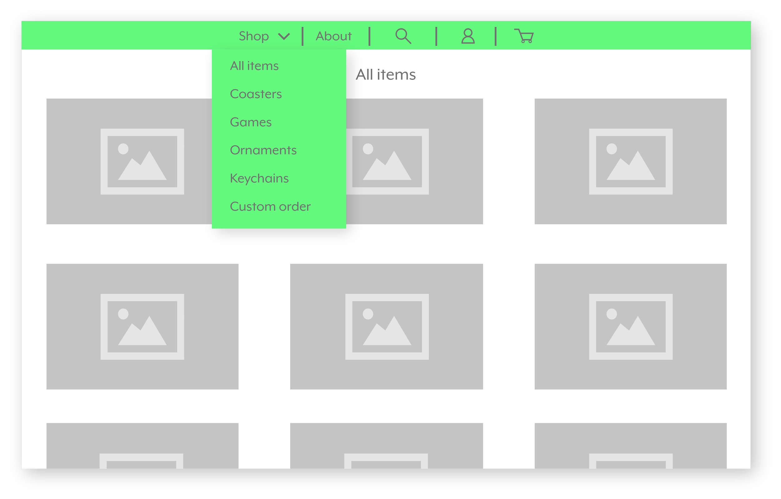
The menu will allow customers to navigate with ease, regardless of what device they use. The users can create custom orders, filter through different categories, and view their shopping bag with little interruption. Less interruption promotes more shopping.
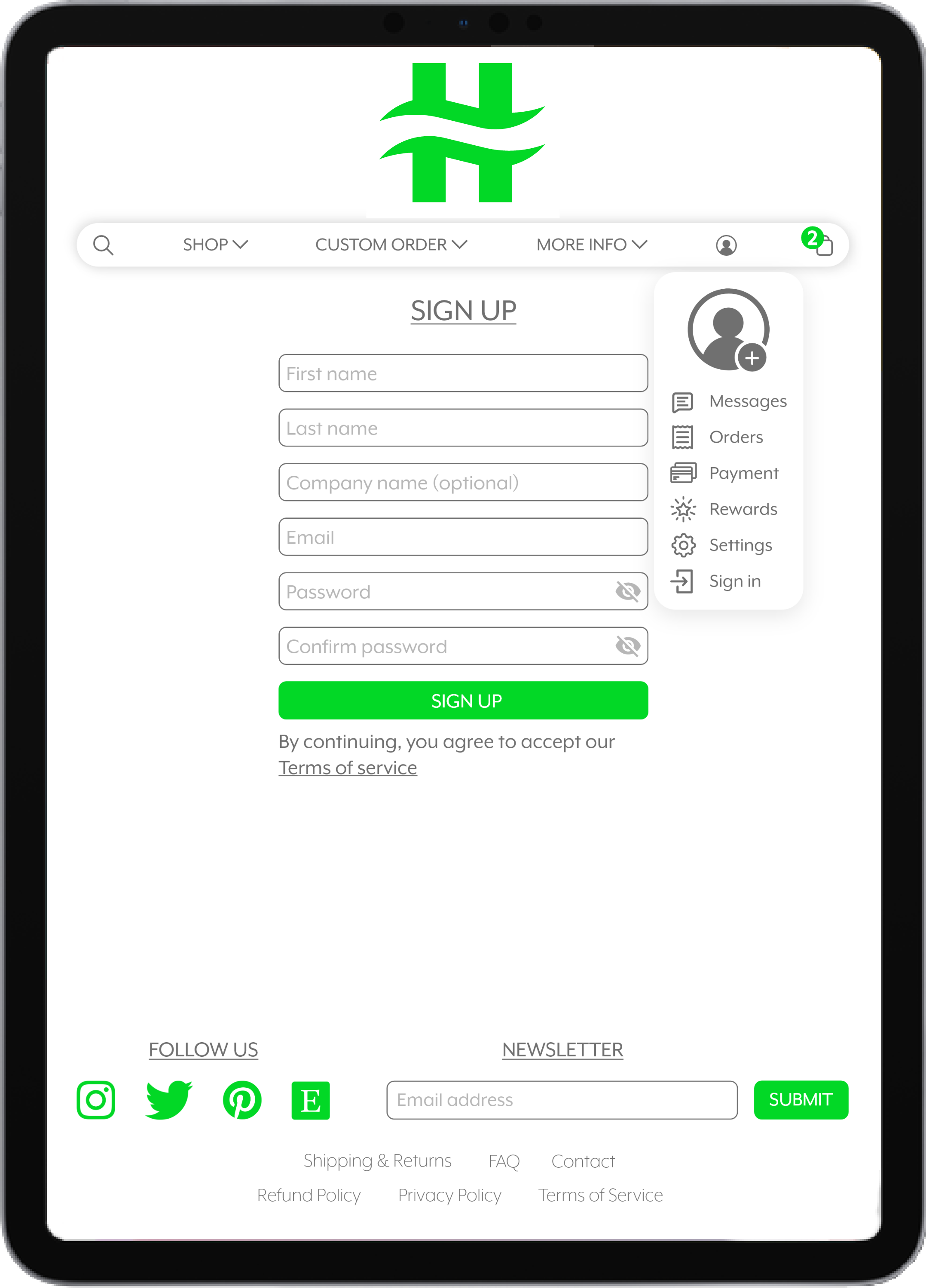
Customers can create a profile for business or personal use. This can be used to save time for multiple orders, custom orders, and bulk orders. The profile menu also allows for easy access to all other information, such as shipping information and messages.
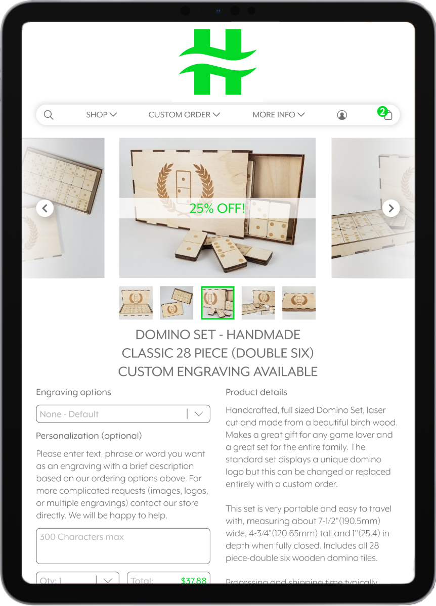
Similar to the mobile app, this screen displays purchase details for the product. Items can be customized using simple dropdown menus and areas for the buyer to add unique text and logos.
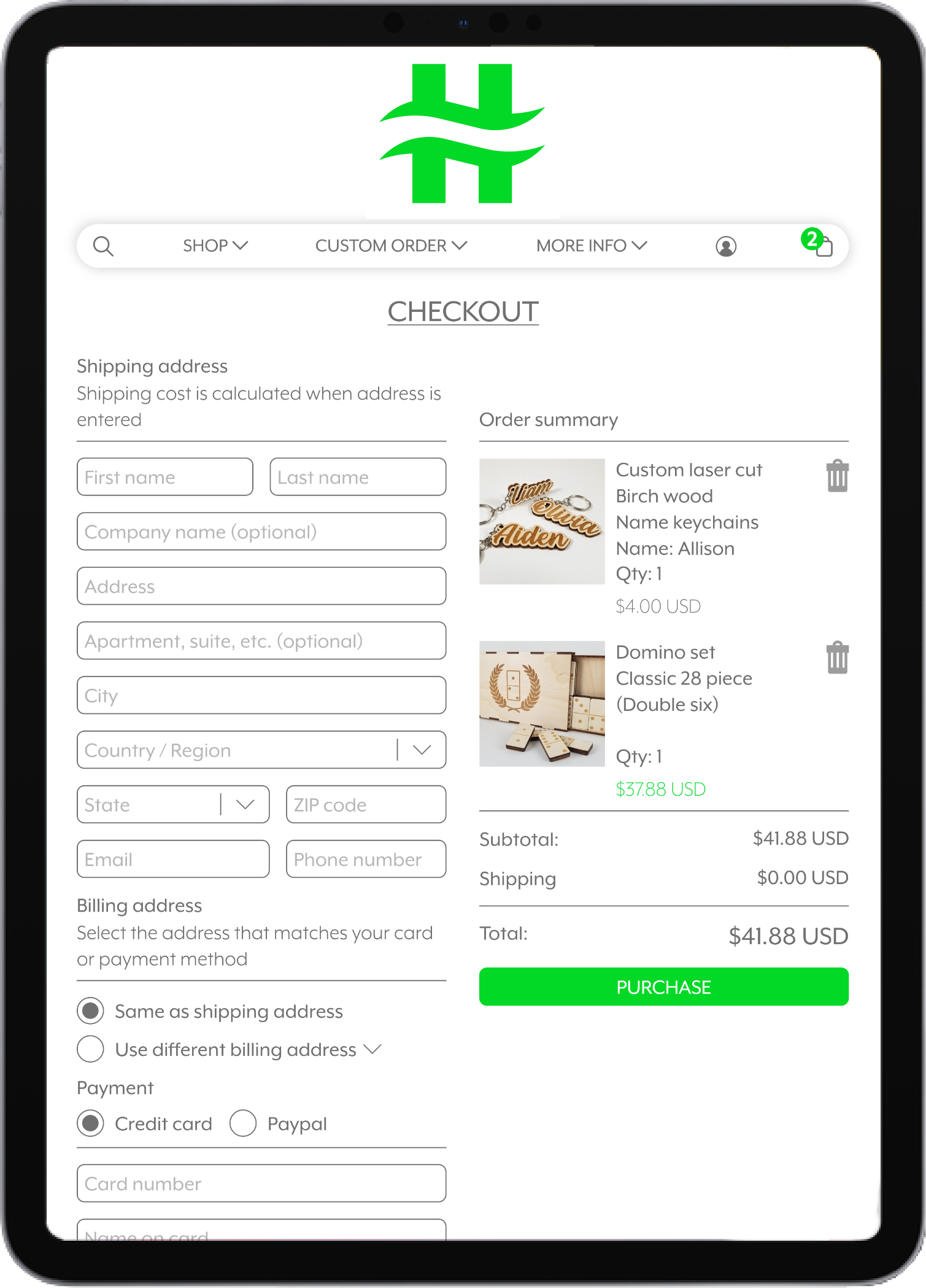
Once the buyer enters their address, the shipping price updates in real time. The order summary displays all items and the total price and is conveniently located on the right for review, expediting the checkout process.
Looking Ahead
Initial research revealed that shoppers have limited time to capture their attention, and most people shop using their phones. Therefore, a simple yet effective user interface was necessary to facilitate easy navigation and purchasing of items, including custom orders. Additionally, this UI system needed to be adaptable across multiple platforms.