Creating a Digital Presence and Branding Identity from Scratch
Background
WP Enterprises started by assisting local individuals and businesses in Richardson, Texas, with tax consulting and preparation. At the time, the company only had an outdated Facebook profile for its digital presence and relied entirely on local word of mouth to attract clients.
Challenge
The company had an outdated Facebook profile before the project. The client wasn't sure what they wanted; they just knew they needed help. The client was also not technically savvy, and we used phone calls and email in order to manage the project.
Tools
Figma
Photoshop
Squarespace
Impact
Website tailored for the client’s specific purpose and services.
Improved client communication and outreach.
Increased company visibility through SEO management.
Created unique branding for the company to stand out.
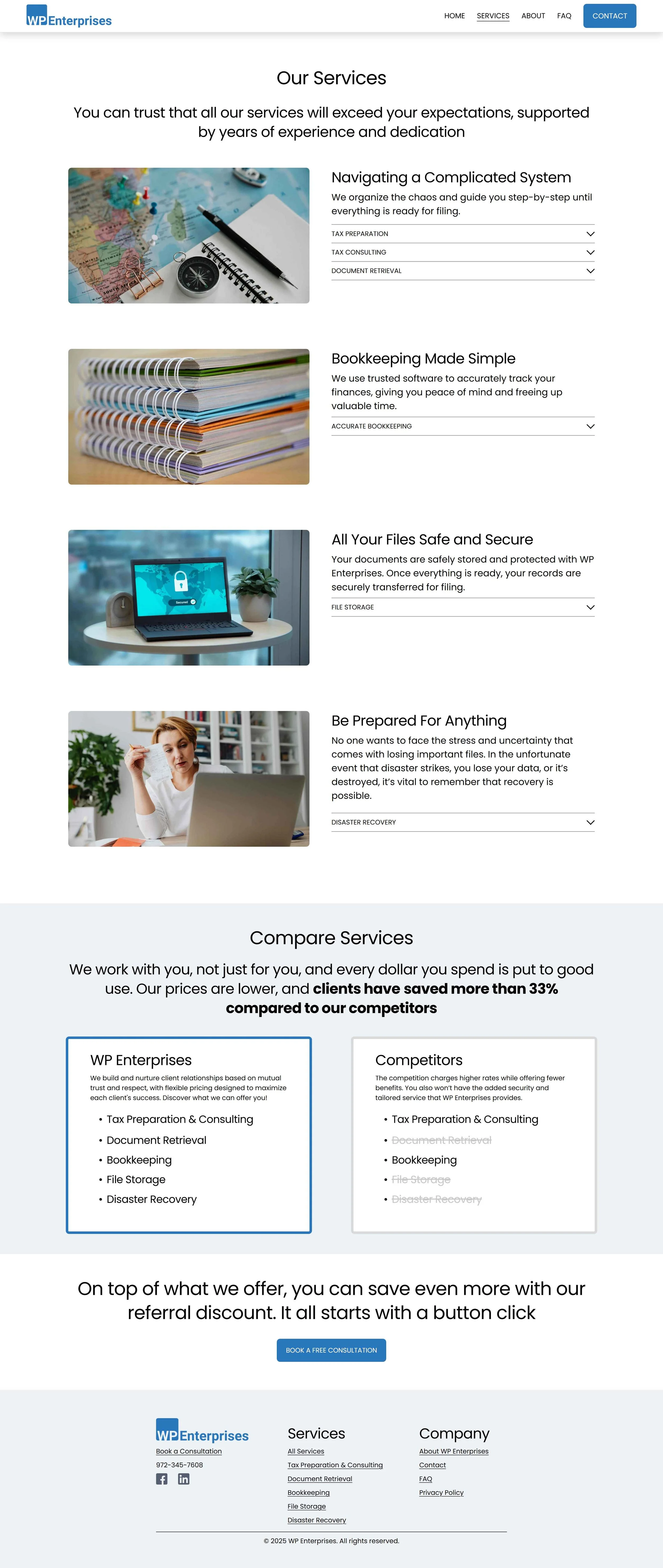
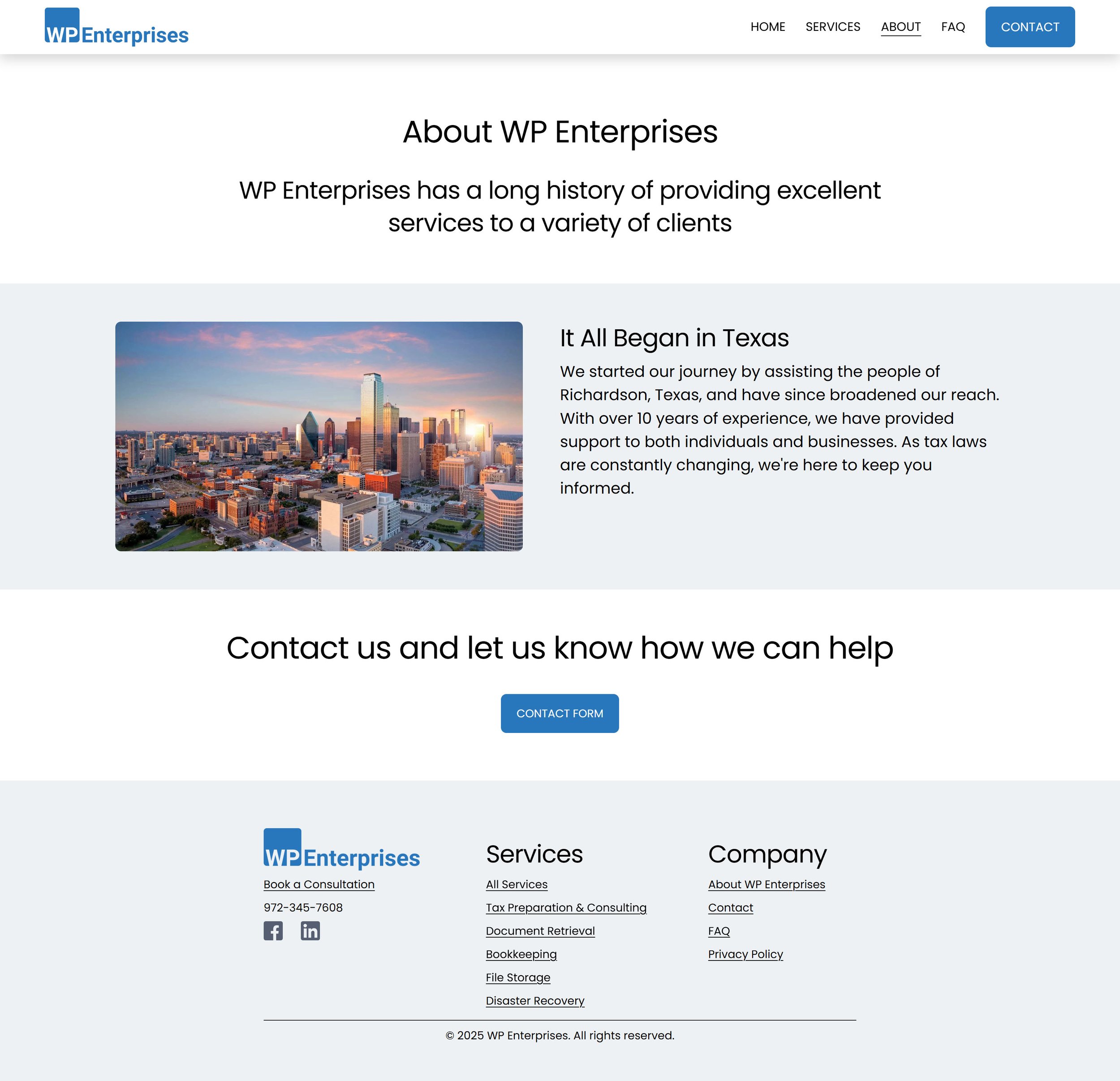
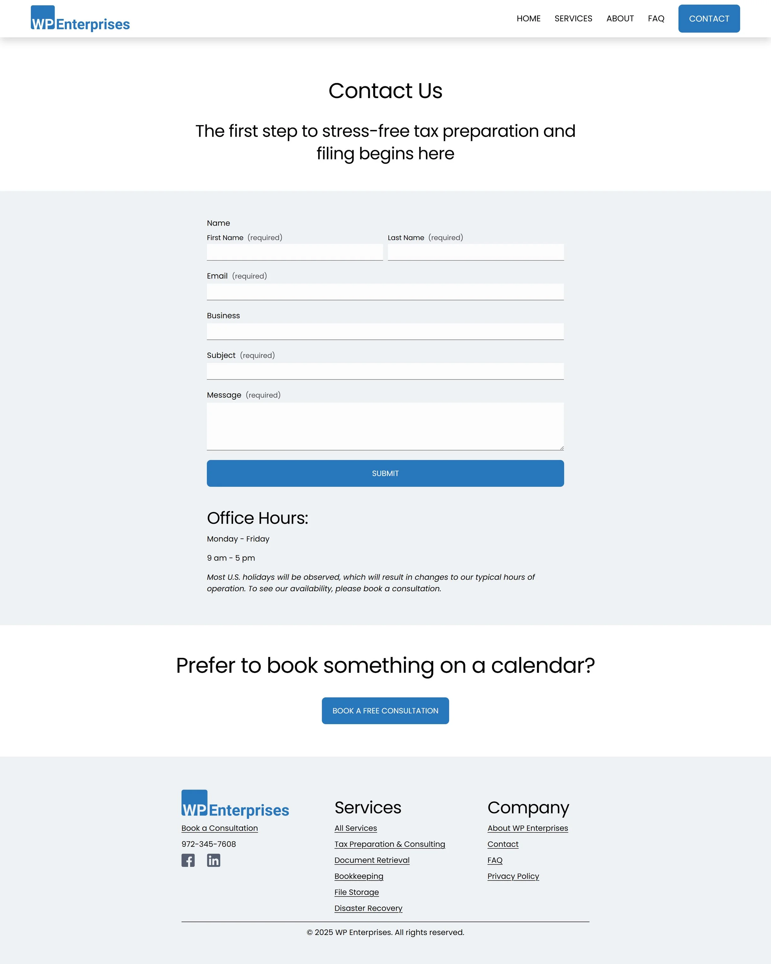
Guiding the Client
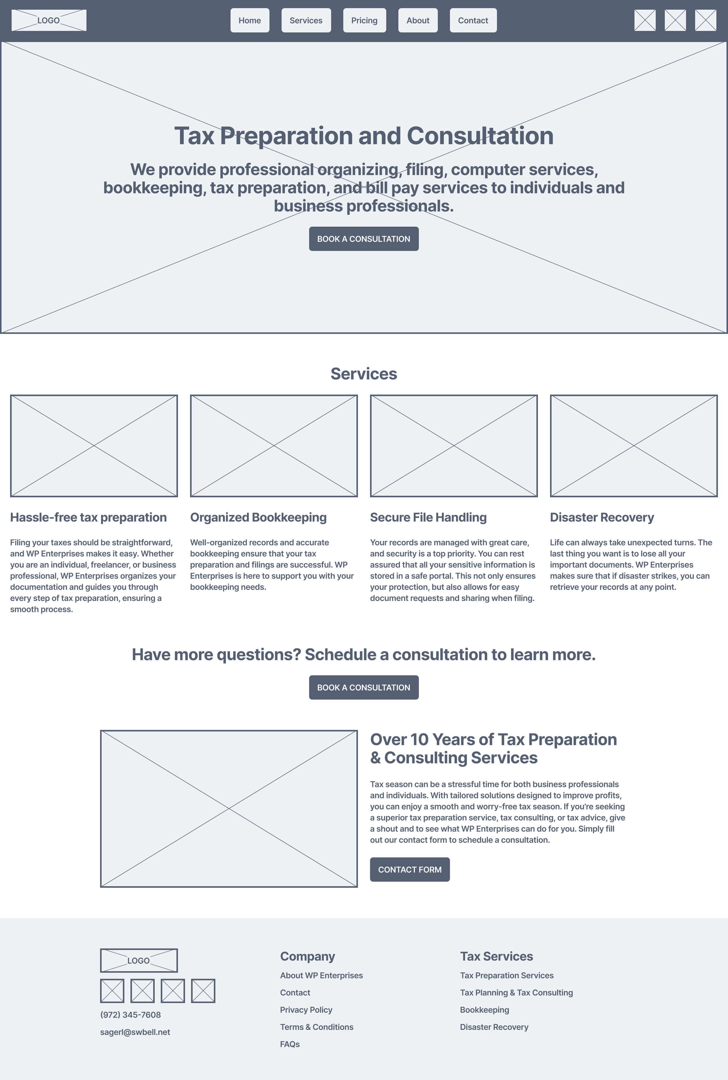
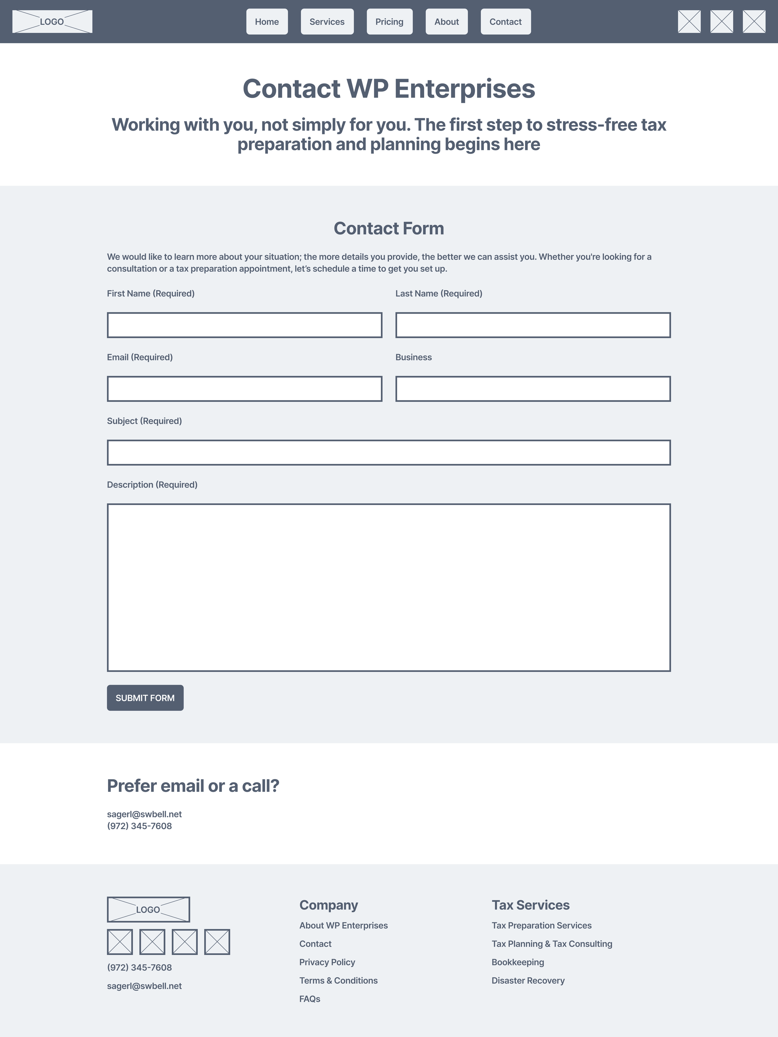
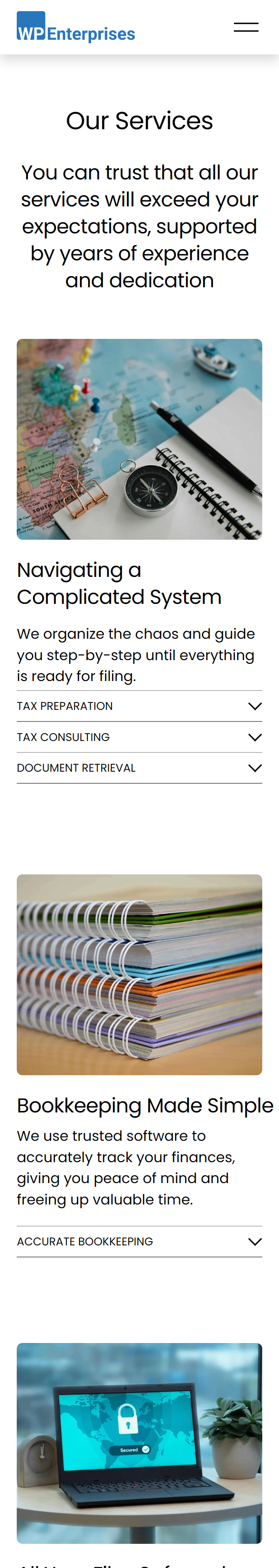
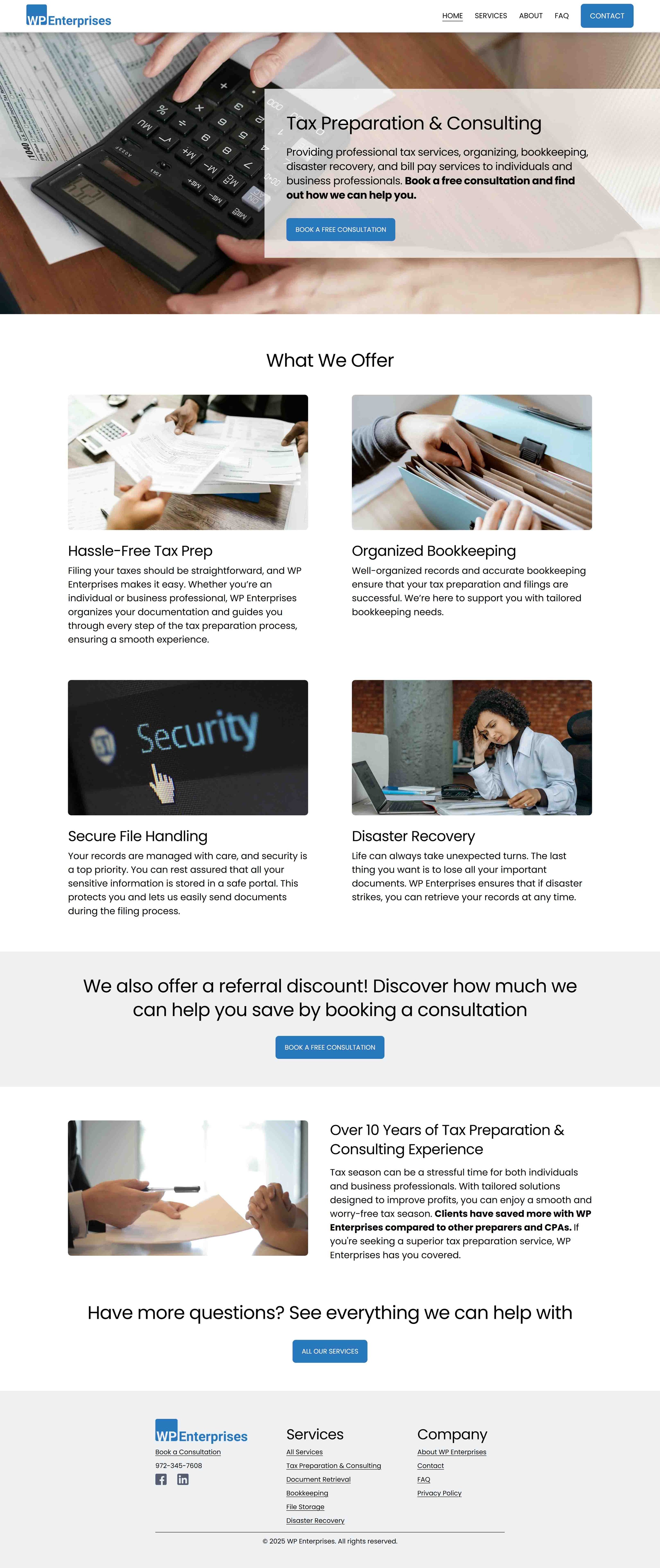
The initial interview with the company owner helped identify the pain points to be addressed and clarify the website's goals. The next task was building the website's structure, ensuring that the initial designs effectively conveyed the company's message and services to potential clients. The sitemap below was utilized to illustrate the structure before any wireframing or design work began.
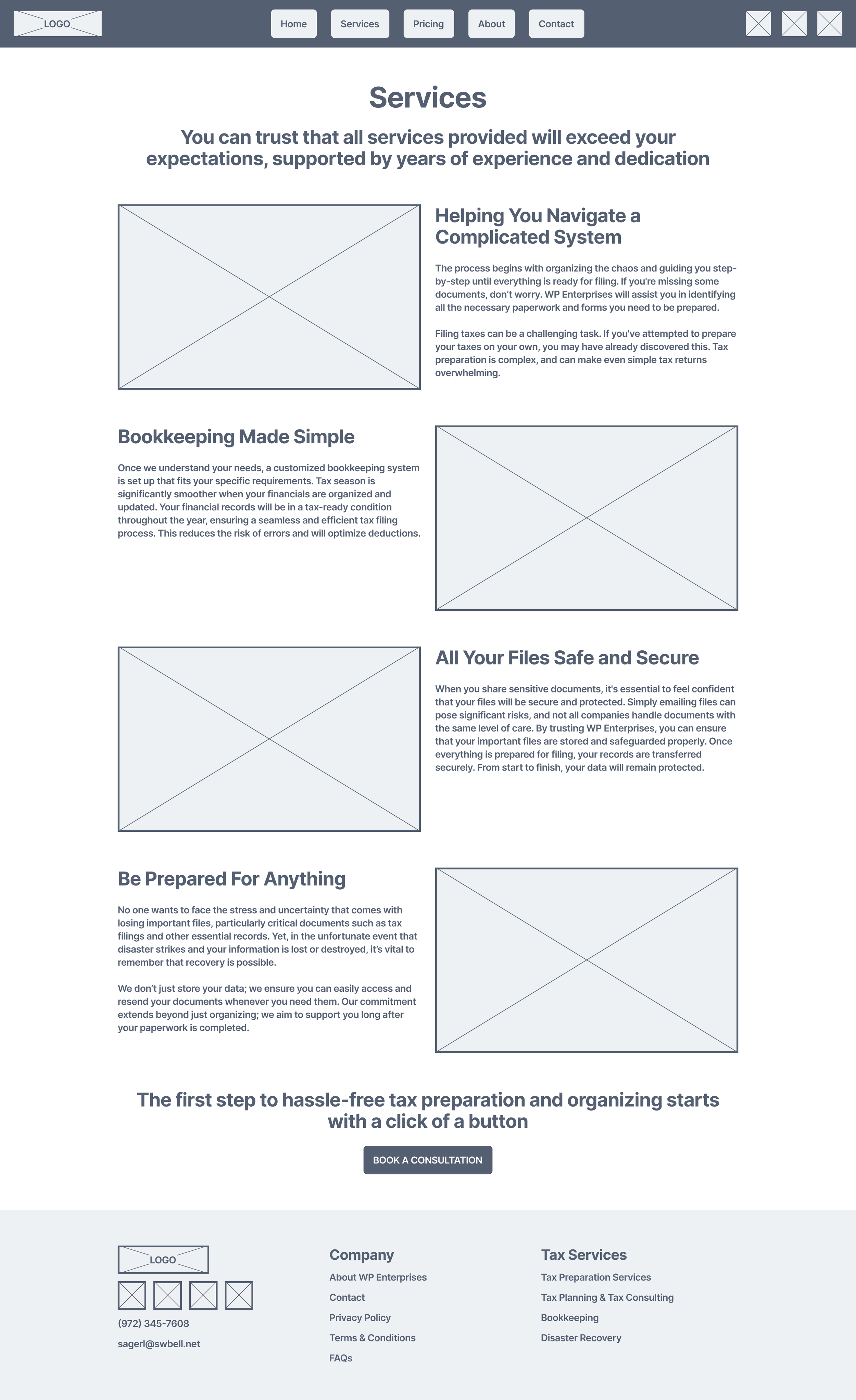
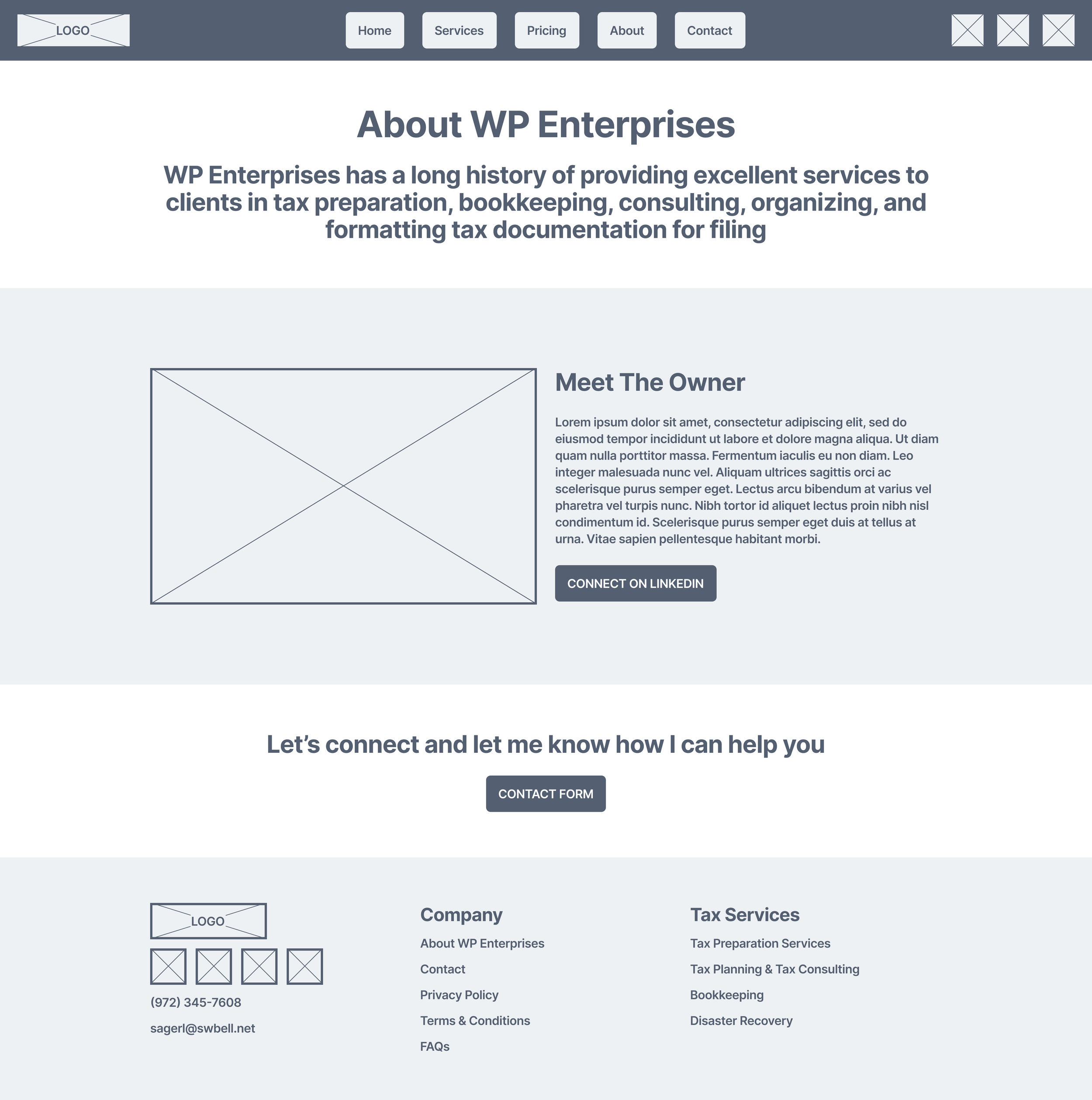
Initial Designs
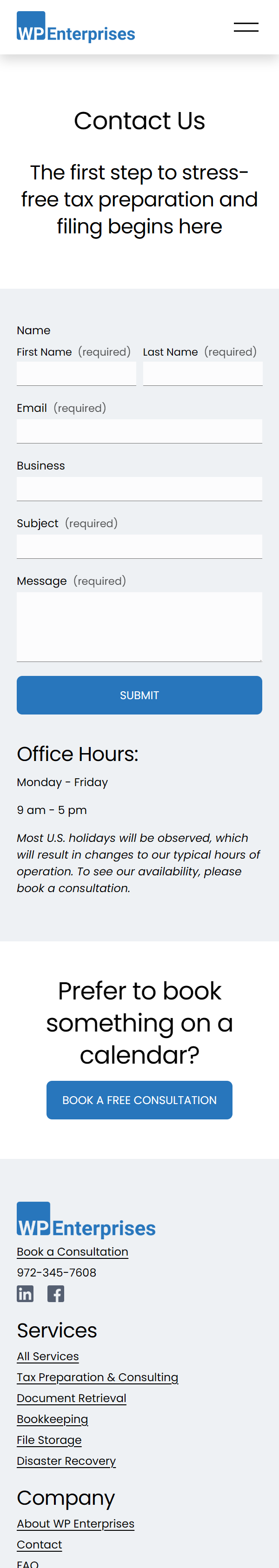
Several concepts were tested to determine the most effective way for clients to access information about the company and its services without being overwhelmed by excessive content on the screen. Additionally, the client wanted to integrate a booking system similar to Calendly.
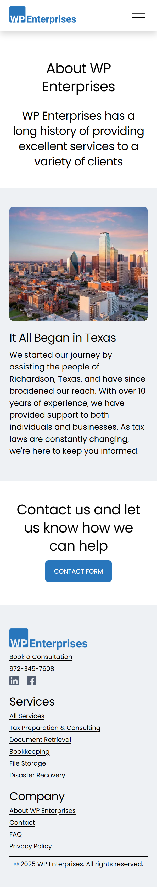
Developing a Brand
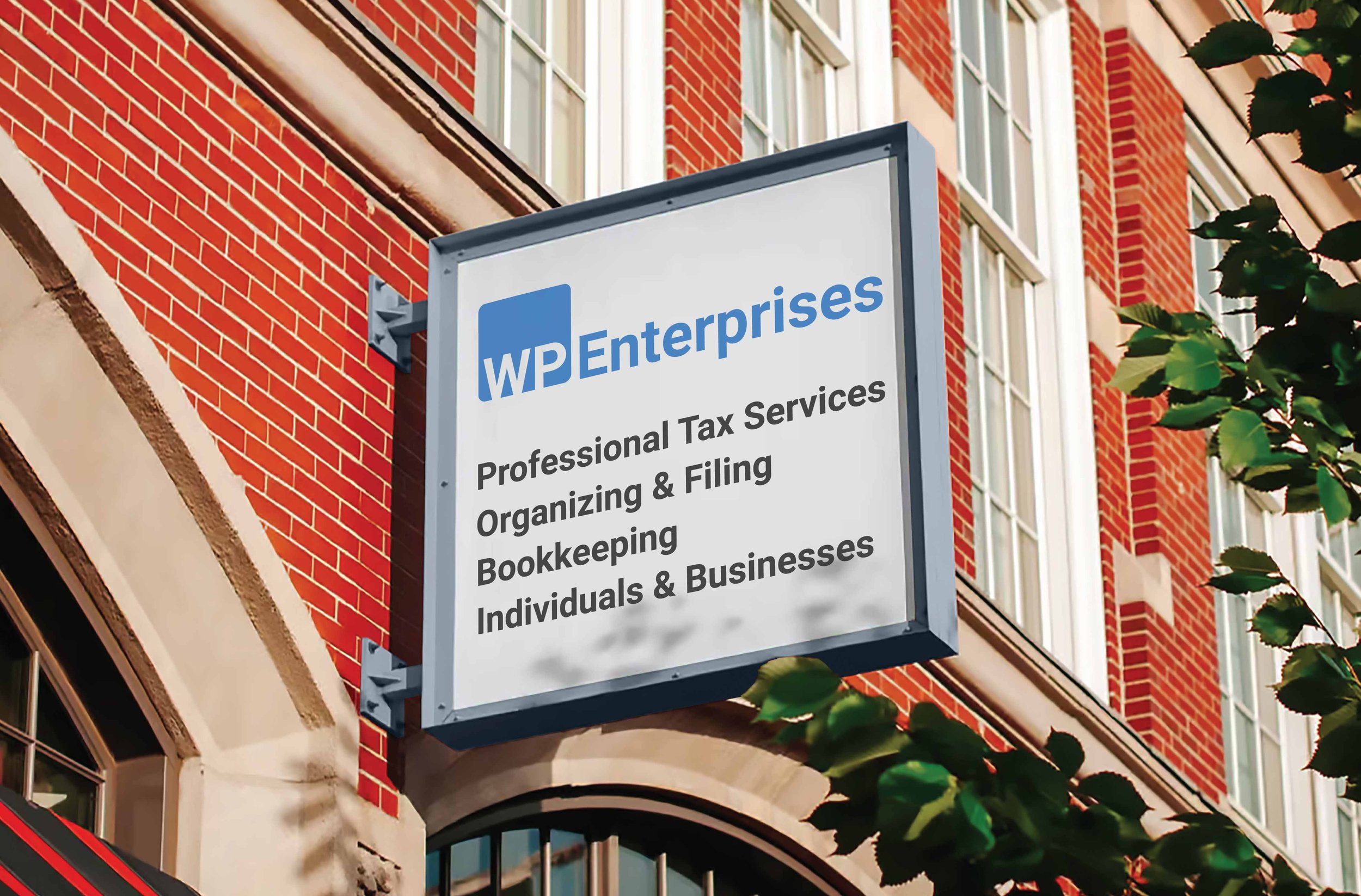
WP Enterprises lacked a strong brand identity, such as a logo or other elements that clients could easily recognize. To address this, research was done on other tax consulting and accounting firms for ideas, and also on LinkedIn for insights. The goal was to create a cohesive brand identity that could be consistently used on the website and easily adapted for different platforms, including mobile devices and physical objects like signs.
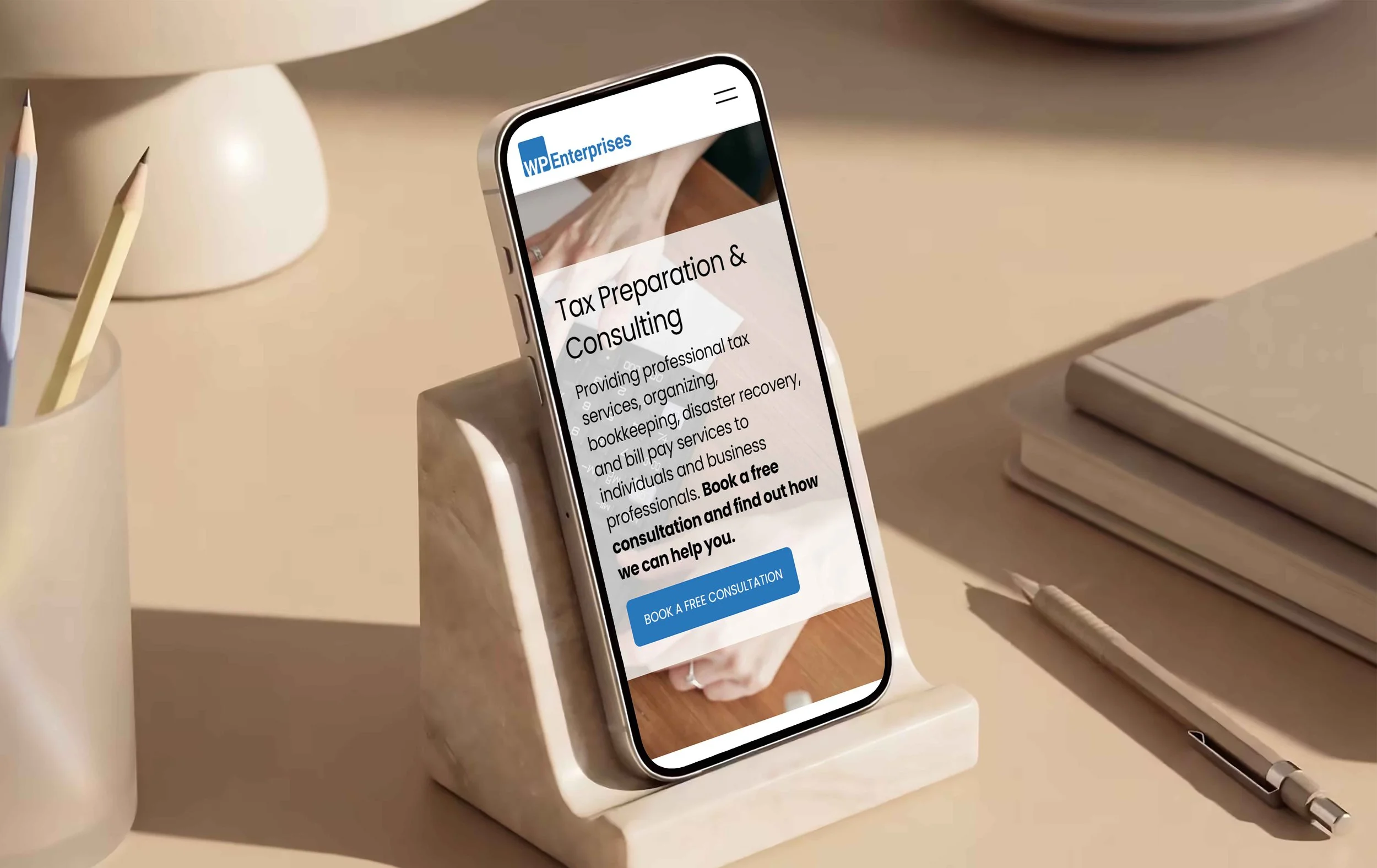
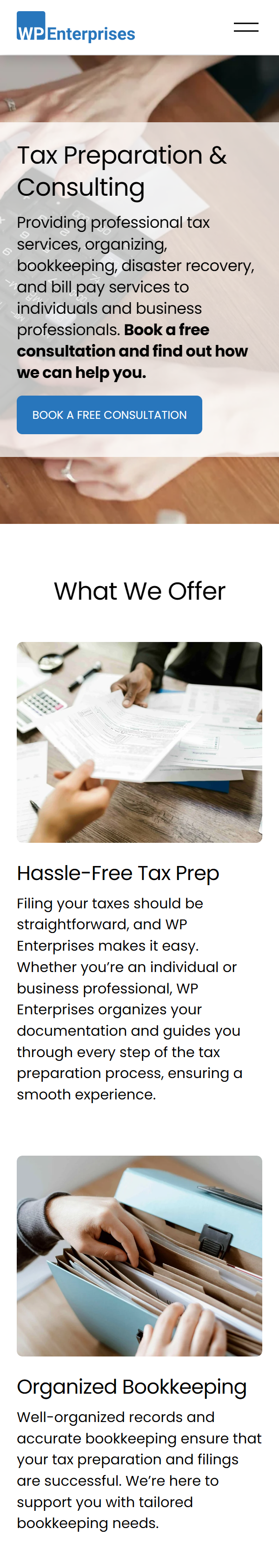
Responsiveness and Accessibility
The website design was crafted to be adaptable across various devices—desktops, laptops, and phones—catering to a diverse target demographic. Accessibility was a top priority, specifically for individuals with physical disabilities, including visual impairments. The site incorporates SEO features and includes alt text for images. User feedback prompted us to test the site at different magnifications and on mobile devices, ensuring a seamless experience for all visitors.
Key Learnings
Conduct market research on branding, website functionality, and messaging.
Continuously test the website across platforms and for accessibility; redesign if it does not cater to everyone, especially those with disabilities.
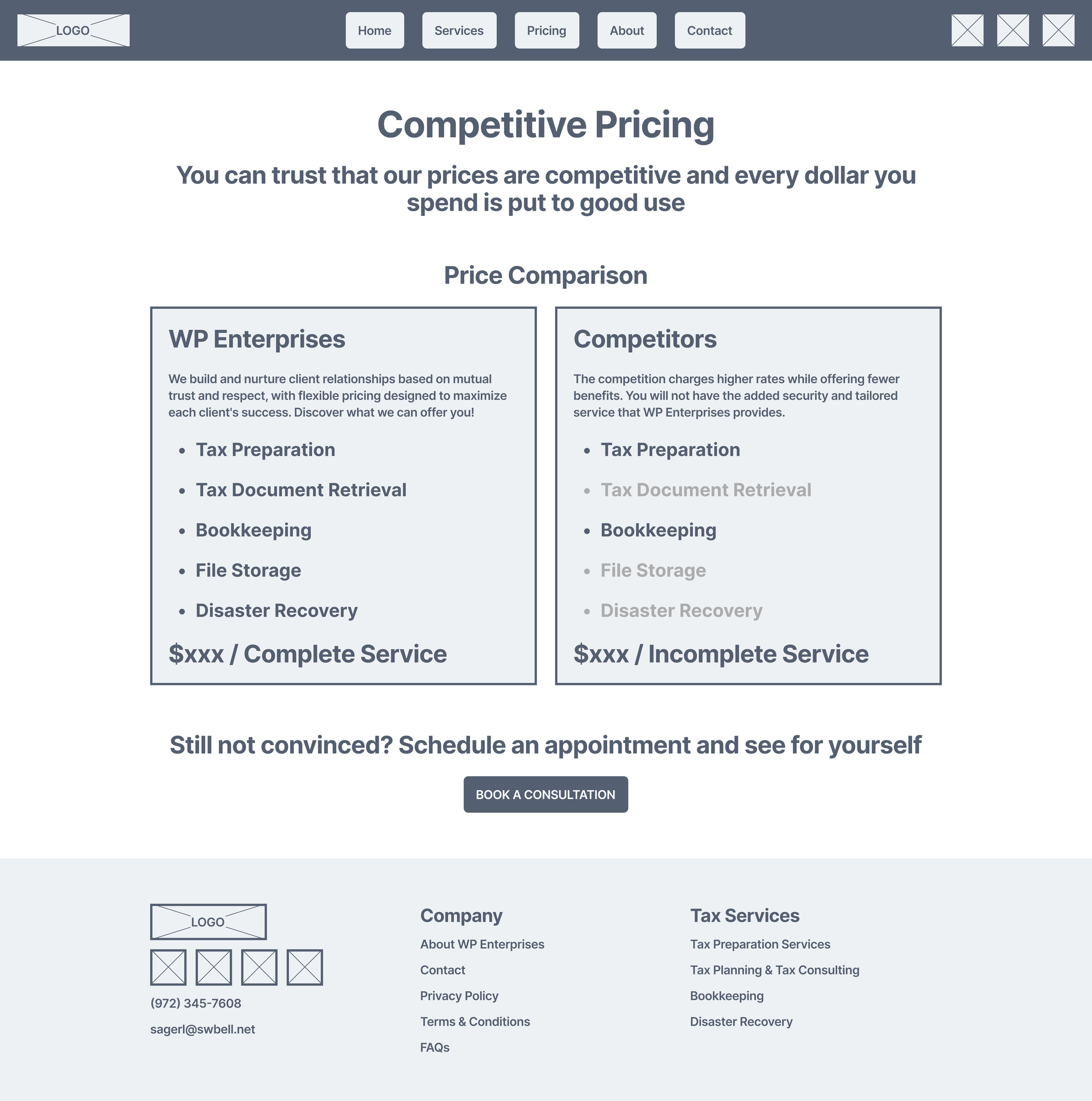
Don’t hesitate to eliminate elements that aren’t effective. For instance, the pricing page was cut from the final design because pricing can vary significantly in this industry.
Keep the client informed about changes in structure and direction to continuously receive feedback and iterate.